Colour Theory
Colour theory is a body of practical guidance to colour mixing and the visual effects of a specific colour combination. There are three basic categories of colour theory; the colour wheel, colour harmony and the colour context.
Colour Wheel

Sir Isaac Newton designed the first colour wheel in 1666. He also discovered that when three primary colours of light (red, green and blue) are mixed in equal amounts, the resault is white light.

In 1766 Moses Harris made a first full-colour wheel; 18 colours were diverted from what he called 'the primitive colours' - red, yellow and blue. He used the colour black because it is formed by the superimposition of these colours.

Colour theory is a body of practical guidance to colour mixing and the visual effects of a specific colour combination. There are three basic categories of colour theory; the colour wheel, colour harmony and the colour context.
Colour Wheel
The colour wheel
(source: photo from the book "Colour Perception - A practical approach to colour theory" by Tim Armstrong, page 6)
Colour wheel or colour circle is a basic tool of combinig colours. It is designed so that virtually any colours you pick will look good together. The most common version is a wheen of 12 colours based on the artistic colour mode. The wheel is devided ito warm and cool colours. Warm colours are energetic and tend to advance in space, and on the other side, cool colours are calm and create a soothing impressiong. The colours black, gray and white are not in the colour wheel - they are considered to be neutral.Sir Isaac Newton designed the first colour wheel in 1666. He also discovered that when three primary colours of light (red, green and blue) are mixed in equal amounts, the resault is white light.
(source: photo from the book "Colour Perception - A practical approach to colour theory" by Tim Armstrong, page 50)
In 1766 Moses Harris made a first full-colour wheel; 18 colours were diverted from what he called 'the primitive colours' - red, yellow and blue. He used the colour black because it is formed by the superimposition of these colours.
Moses Haris's colour wheel
(source:
http://kidugly.blogspot.co.uk/2010/11/color-wheel.html -date: Oct 14th 2014)
Colour Harmony
There is a number of colour combinations that are considered especially pleasing to the eye and that work well together. These are called colour harmonies or color chords. They consist of two or more colours with a fixed relation in the colour wheel. Here are some examples:


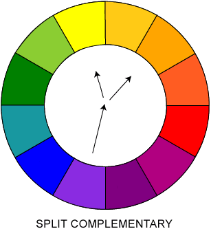
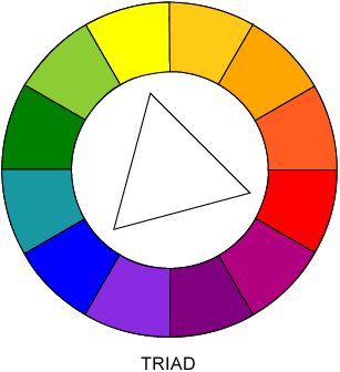
Analogus, complementary, split complementary and triad colour harmonies
(source: webdesignref.com/chapters/13/ch13-15.htm -date: Oct 15th 2014)
Colour Context
Colour context is described in terms of how colours behave in relation to other colours and shapes.

Colour context
(source: scm.ulster.ac.uk/~B00584676/DES106/index.html -date: Oct 15th 2014)
Reference sources:
Armstrong T. (1991) Colour Perception - A practical approach to colour theory. Tarquin Publications
Armstrong T. (1991) Colour Perception - A practical approach to colour theory. Tarquin Publications
Nema komentara:
Objavi komentar